Williamsburg · Brooklyn
A Williamsburg Kitchen Palette That Works Beyond the Photograph
Choosing Williamsburg kitchen finishes? Compare cream cabinets, blue tile, counters, hardware, and wall samples in your daylight and evening light.
4 min read · Updated · By LOKEIL Renovation
Plan a similar project →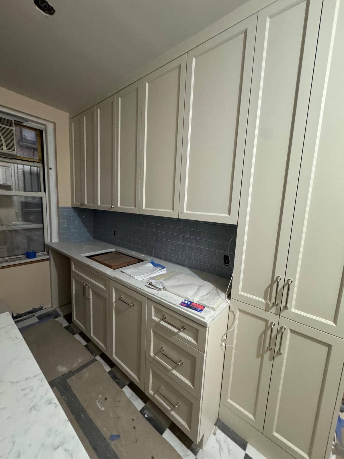
You save a kitchen photograph because the cream cabinets and blue tile feel right together. Back at home, a similar blue sample looks dull against your counter, and the cream door seems warmer under the light you use in the evening. The photograph has given you a direction. The room still needs to make the decision.
This LOKEIL image brings the cabinet doors, blue backsplash, pale patterned counter, and metal pulls into one view. A window is visible, but a single exposure cannot show how the finishes look through a whole day. For a Williamsburg kitchen refresh, use the combination as inspiration and compare real samples where you will live with them.
Choose the combination you enjoy in the room, at the times you use it.
Build one palette from the surfaces that stay
Start with the least flexible surface. If the counter or cabinets are staying, place proposed tile and paint samples beside that actual finish. If everything is changing, gather the selected door finish, counter sample, tile, grout reference, hardware, and wall color into one small set. Keep the product names with it so the discussion refers to identifiable choices.
Set cabinet and wall samples upright, and review counter and floor samples in the position they will occupy. Compare the cream beside the blue, then beside the counter. Look for the relationship you like rather than trying to copy the color of a phone image. The photograph does not establish a paint formula, tile glaze, stone type, or cabinet manufacturer.
Benjamin Moore’s lighting guidance recommends assessing both natural and artificial light and testing color in the room over time. That supports checking your own sample set; it does not identify any pictured finish as a Benjamin Moore product. Avoid committing to a full order from a screen comparison alone.
A closer look
Keep the samples together as the light changes
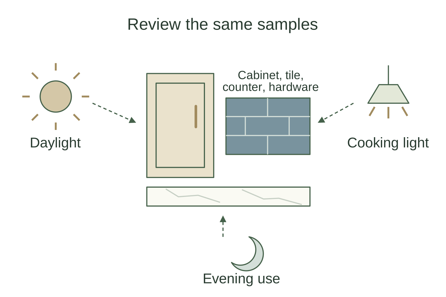
- Gather the retained surfaces and exact proposed finishes.
- Return to the same set in daylight, cooking light, and evening use.
- Record the chosen products and define the installation scope.
Spend a day with the same sample set
Leave the candidates together and return when you normally use the kitchen. Compare available daylight with the lighting you use for cooking and in the evening. Rooms differ in orientation, shade, and fixtures, so a universal rule about morning or evening color cannot replace what happens in yours.
Make a short note of what changes. Does the cream look comfortable against the counter? Is the blue still the feature you wanted? Do the metal pulls disappear or catch more attention? Move the set from the brighter part of the room to the corner or cabinet run that receives less light.
If lighting will change during the renovation, include the proposed fixture information in the finish review. The temporary light used during construction may not represent the final kitchen. Ask to assess the proposed arrangement before giving the final color approval, with electrical work coordinated by the responsible professional.
A photograph can help you remember which sample was where, but keep your written observations and exact product selections. Phone exposure and screen display can alter the comparison. If the choice only pleases you in one saved image, give the actual samples another look before ordering.
- Daylight: note the cabinet, counter, and tile relationship together.
- Cooking light: compare the work area and the darker part of the run.
- Evening use: review the same set with the fixtures you intend to use.
- Final choice: record the exact products and which surfaces will stay.
Approve the finish and define the work separately
Color approval should identify the selected product and finish, not only a word such as cream or blue. Include grout and visible edge choices where they affect the backsplash. A cabinet door sample is more useful than a recollection that the door looked warm in the showroom.
Then state what changes in the kitchen. Replacing the backsplash beside retained cabinets has a different scope from new cabinets, counter, tile, and lighting. Include wall preparation, exposed edges, protection, and any adjacent painting in the appropriate estimate. A coordinated palette does not settle the construction details.
At the final review, look at the completed room under its normal lighting with temporary coverings removed. Use the product record and agreed scope to discuss any remaining work. The best part of a finish choice is recognizing the combination you liked when you return to the kitchen for an ordinary evening.
Choose a starting point
Refresh selected surfaces
Compare proposed tile and paint beside the cabinets, counter, and hardware that stay.
Choose a new kitchen palette
Review the door, counter, tile, grout, hardware, and wall finish as one identified set under the intended light.
Your room, your next step
Plan a Williamsburg kitchen finish palette
Prepare a short brief, then open it in your email app. Add room photos and any building requirements before sending to LOKEIL.
Preview your email brief
Hello LOKEIL, Project neighborhood: Williamsburg, Brooklyn I am a: Homeowner Building type: Apartment / condo / co-op Work I am considering: Retained surfaces, cabinet and backsplash samples, counter and hardware relationships, actual lighting review, and finish installation boundaries Timing: Exploring the scope Best number to reach me: Room conditions / building access / questions: I can attach current room photos, approximate measurements, and building requirements before sending. Article I read: https://lokeilremodeling.com/blog/cream-kitchen-cabinets-against-a-blue-backsplash
This prepares an email draft. LOKEIL receives your brief only when you send it. Prefer webmail? Copy the preview and email info@lokeilremodeling.com.